How to Center-Align Text in Mobile ONLY in Squarespace
When you're designing your website, the primary focus is often on the desktop version, but the mobile experience of your Squarespace website is just as important!
With nearly 60% of all website traffic coming from mobile devices (Source: Statista) it’s imperative that your site looks great and functions well on both desktop and mobile.
The great thing about having a website through Squarespace is that all Squarespace sites are designed to look great on mobile devices from the start. However, the automatic formatting on mobile can shift a bit depending on what content you include, how much content you have on your page, and how you lay that content out.
So when it’s time to optimize your site on mobile devices you might notice that there are a few things you’d like to change to make everything look as nice as it does on the desktop version. One of the most common tweaks is updating the alignment of certain blocks of text because it reads a bit differently on a small vertical screen than it does on a larger desktop.
In this post, we're going to give you some tips on how to best think about and use text alignment on the mobile version of your website, and how, with just a few lines of code, you can easily center your text on mobile.
So, let's get started!
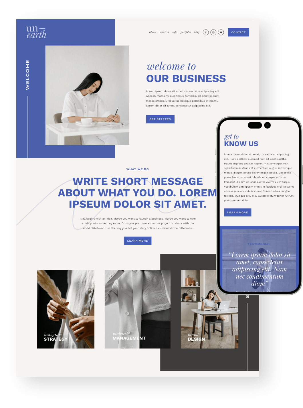
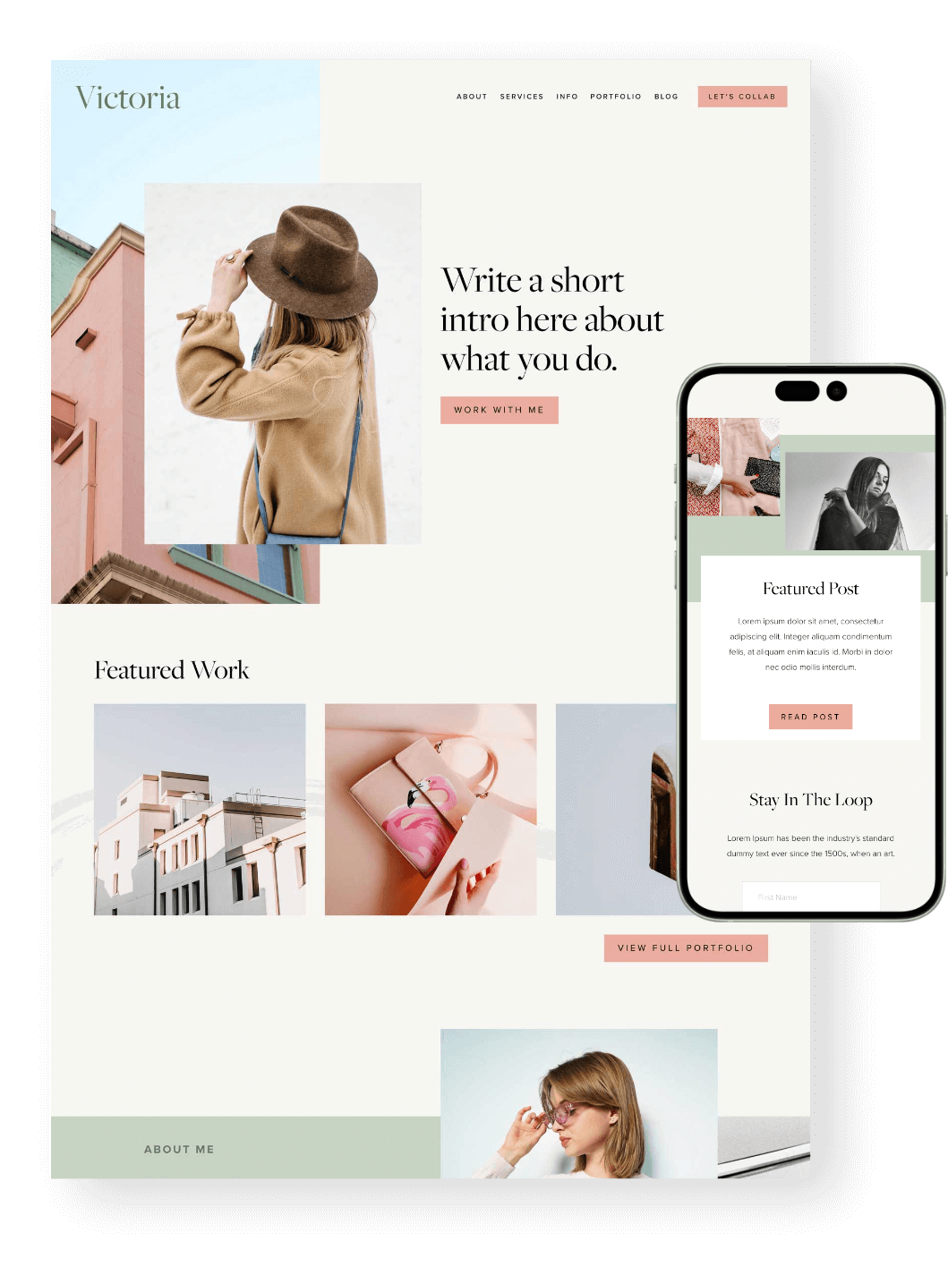
PS. Did you know that all of our Squarespace Templates are optimized for mobile from the get go? Not only will you get a beautiful design to start with, but you’ll also get hours of our most up to date tutorials all about learning Squarespace. Check them out below! 👇
Tips for Text Alignment on Mobile
Proper text alignment is a small but significant part of your website design that is often overlooked!
On the surface, it may seem like a small detail or a design preference, but proper (or improper alignment) can really make or break your design. Alignment goes beyond design; it actually affects how our brain takes in and processes the content on the site.
Before walking you through how to update the alignment of certain text on mobile, let's take a look at a few basic guidelines we use for text alignment on mobile.
Tip 1: Consider Center-Aligning Headlines or Small Blocks of Text, like Quotes
On mobile, a good rule of thumb is to center-align text that is 1-2 sentences in length. This allows for the content to be neatly designed while drawing the eye in to quickly grab the short bit of content.
Don't feel like you always have to center-align small amounts of text, though! Depending on the purpose and the content around it, your short heading might work as it is.
Let's take a look at a quick visual to bring this to life! The quote below is pulled from the mobile version of a website.
You can see that leaving the quote left-aligned works well, but when you center the text, it draws the eyes in and creates a balanced look with a symmetrical format:
Tip 2: Always Left-Align any Long Text
If you have text that's longer than a few lines, we'd recommend keeping it left aligned. The reason is that when you center-align a long block of text, you're forcing the reader to continuously move their eyes back and forth and work to find where the next line is. Think of it like any book or article you read. The reason the content is left-aligned is that it helps with readability!
Here's a visual that helps illustrate this point. If you go back and forth between the two, which do you find easier to read? You'll probably say the one on the left. That's because the left alignment creates a straight line down, which makes the text easier to read:
Tip 3: Choose one Alignment per Section of Text
Our last guideline when considering text alignment is that you should never combine alignments for text that is in the same section. I’m sure there are exceptions to this rule, but more often than not, it just doesn’t work well.
Here’s an example using the same section of text:
Separate the heading and paragraph text from one another and they look great, but when you combine the two it feels unbalanced. This is because the line lengths of the paragraph text hit the right side of the screen at different points, which makes the headline appear like it’s off-center.
If you have text that is best with a left alignment, you should also left-align any headings, subheadings, or even buttons that go with that text to create balance and enhance legibility.
Now that we've gone through why text alignment is so important to consider, especially on mobile devices, let's walk through how to change the alignment of text on mobile devices!
Aligning Text on Mobile Using Code
Take a look at your Squarespace website and identify the specific blocks of text you want to center on mobile devices. This could include headings, subheadings, featured text, or any other short snippets of text that you want to stand out on your website.
Because you likely won't need all text changed in the mobile design, within our CSS code we will need to specify which block of text we would like to change on mobile using its unique Squarespace block ID.
Find Your Unique Block ID
This is pretty easy thanks to the Google Chrome extension, Squarespace ID Finder.
Once you've installed the extension, follow the next few steps to find your Block ID:
Using Google Chrome, install the Squarespace ID Finder extension to your workspace.
Head over to your website and go to the page where the shape block you want to customize is located.
Click on the Squarespace ID Finder icon in your browser toolbar to activate it.
Click on the ID that pops up for your shape block to copy it to your clipboard.
Tip: We recommend pasting that ID somewhere handy - like a Word document or in your Notes app. We’re going to copy one more piece of code before adding the ID in, so this will prevent you from needing to go back to find your block ID!
Add in Your CSS code
Now that we've identified the block ID, let's start optimizing your text alignment on mobile!
Copy and paste the following code in your Squarespace website's custom CSS panel (Design > Custom CSS) and replace #INSERT-BLOCK-ID-HERE with the block ID code you just pulled from the Squarespace ID Finder extension.
@media only screen and (max-width: 767px) {
  #INSERT-BLOCK-ID-HERE {
    text-align: center;
  }}
This code snippet is specifying that that particular bit of text (via the block ID) will be center aligned on all sizes with a maximum screen width of 767px (a common mobile screen size breakpoint).
Tip: To condense the lines of code in your Custom CSS panel, you can separate multiple block IDs with commas to target multiple blocks with one piece of code.
Here's an example:
@media only screen and (max-width: 767px) {
  #INSERT-BLOCK-ID-HERE, #INSERT-BLOCK-ID-HERE, #INSERT-BLOCK-ID-HERE {
    text-align: center;
  }}
@media only screen and (max-width: 767px) {
#block-61d0ce569673080e2fb2c21d,
#block-61d316a6391c9554f4a66c54,
#block-61e790ed2c49921df3256430 {
text-align: center;
  }}
That's it! Your block of text should now be centered on mobile devices using CSS. Repeat these steps for any other blocks of text you want to center.
Using CSS to center specific blocks of text on Squarespace websites is a simple and effective way to improve the readability and aesthetics of your website on mobile devices. As traffic continues to grow on mobile, this is a small, but important detail that will ensure your content is accessible and effective to your website visitors!
Explore more of our tutorials about mobile optimization below 👇
How to Change Mobile Logo on Squarespace
Mobile Optimization: Creating Responsive Squarespace Sites
How to Adjust Your Mobile Menu in Squarespace
Hacks to make mobile editing in Squarespace Fluid Engine faster
If you liked this post, Pin it to Pinterest! 👇🏻


