10 Fun Customisations for your Header Navigation Menu in Squarespace
A website’s header navigation is a crucial element that can make or break any site.
Being right at the very top, this is one of the very first things your visitors will see when they land on your site, and likely one of the first things they will click on to explore your site’s contents.
How easy your site is to navigate is key to keeping your visitors on your site, keeping your conversion rates high, and your visitors engaged ✨
While Squarespace does offer a few built-in options when it comes to customising your header navigation, we’ve been getting a ton of requests on how to customise this little feature one step further. So we decided it was high time to round up all of our favourite customisations from some of favourite Squarespace experts and plugin shops to share with you all!
Ready to give your header menu a total makeover? Check out our top picks for easy to implement and super fun header customisations below👇
Mega menu
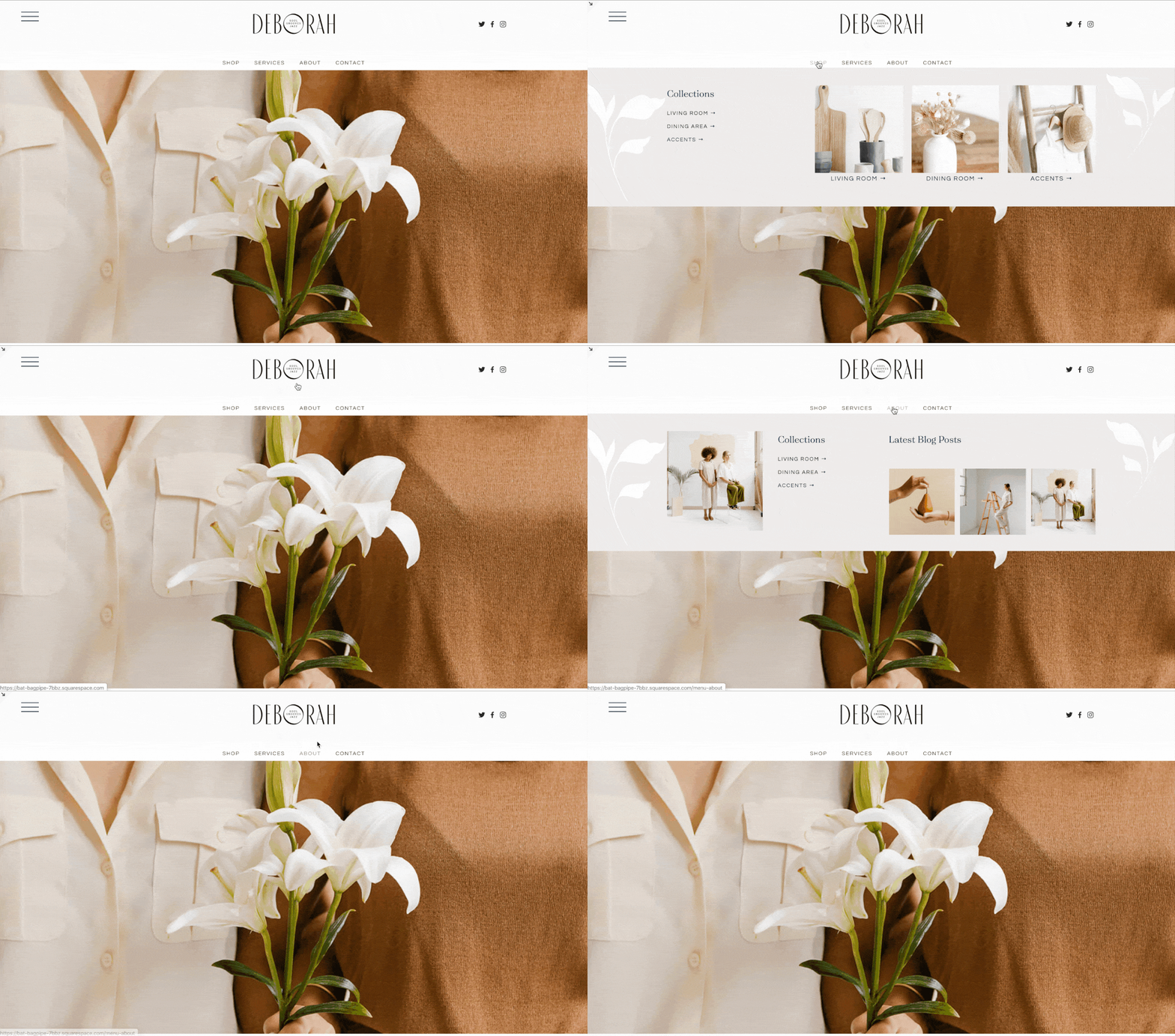
Squarespace’s built-in navigation options can be a little limiting, especially for more complex sites or those with lots of categories to showcase.
This is where a mega, expandable menu, like this one created by Squarespace pro Will Myers, is the perfect solution.
Easy to implement with just some copy + paste code and a simple install tutorial, this plugin will set you back just $10, which, if you ask us, is a pretty great deal for not having to figure out all that custom CSS yourself!
Mobile menu for desktop
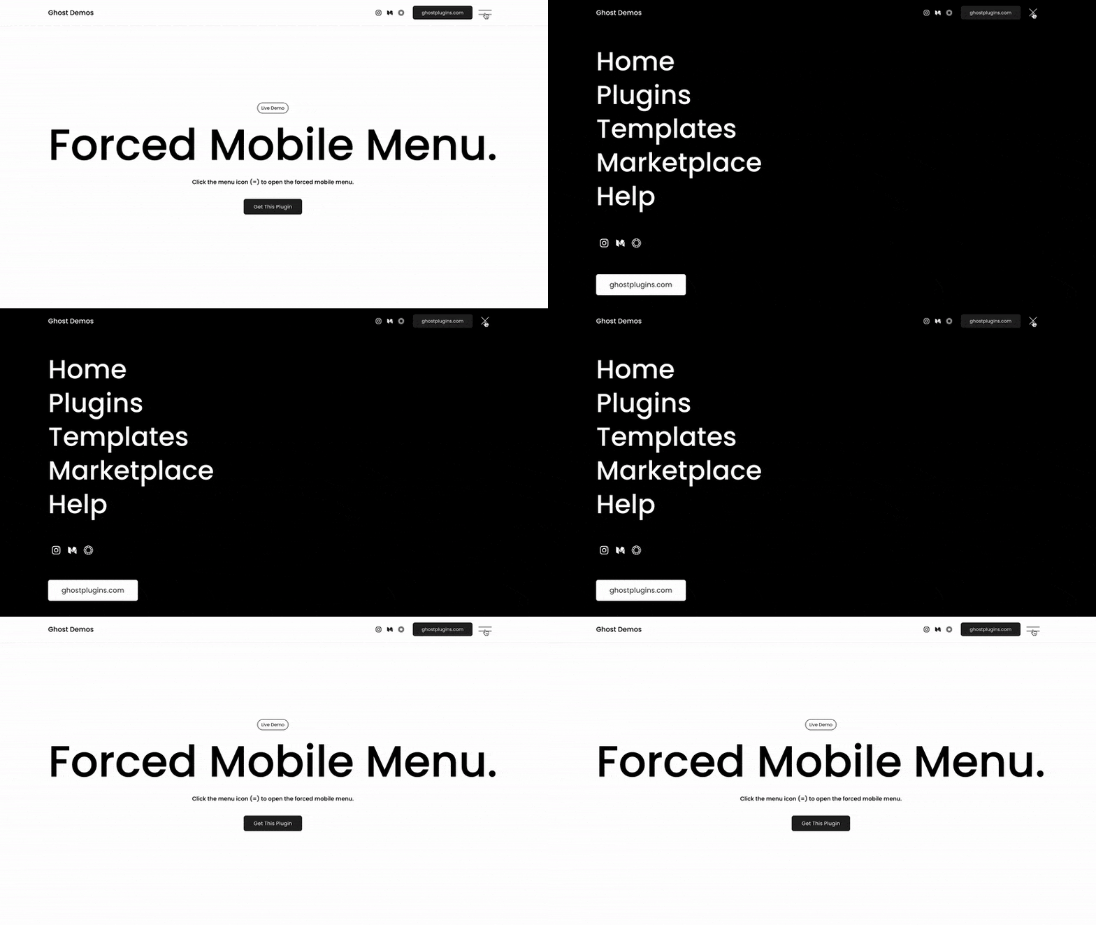
We love a super simple hamburger menu like the default that Squarespace uses for their mobile adaptation, and, with this plugin, you'll be able to set this as your default for your site's desktop view as well!
This simple and sleek design is perfect for minimalist sites with a clean aesthetic, but is also ideal for photography sites with large images that a regular menu might obstruct, or get lost in.
Containing just a few lines of easy to customise code, this plugin by Ghost can be installed on any Squarespace 7.1 site for just $25.
👉 Get the Plugin here 🧡 Use our discount code BIGCATCREATIVE for an extra 10% OFF
Vertical header navigation
Another fun plugin by Ghost, this one is free to use and will give your website a total revamp!
Bold, dramatic, and definitely on the unique side, this easy copy + paste code will left align your navigation bar vertically.
Easily adjust the padding and background colour of your vertical header menu with a quick tweak to the code!
Horizontal lined navigation
This one is gorgeous, and definitely a fave!
Sleek, minimal, and modern, a lined header is a unique way to showcase your navigation options, and the team at The Styled Square have created the perfect plugin so that you can easily recreate this effect on any of your Squarespace 7.1 sites!
This plugin will set you back $59 and includes copy + paste code and in-depth tutorials for a couple of different header looks so that you can kiss the boring ol' Squarespace header styles goodbye once and for all!
Header navigation icons
We love a bit of visual storytelling! With this fun plugin, you can add custom icons to your header navigation links, giving a totally unique and on-brand flair to your site from the get-go.
While this plugin doesn’t include any icons, you'll be able to easily create your own to perfectly match your brand aesthetic in a graphic design software like Canva, or find ready-to-download, customisable icons on Feather or Google Fonts.
Let the Ghost team teach you how to implement this header style for $20, including all the code and instructions you'll ever need!
👉 Get the Plugin here 🧡 Use our discount code BIGCATCREATIVE for an extra 10% OFF
Custom menu mini-course
If you’ve been working with Squarespace for a while, you’ve probably heard of Rache from Square Stylist for all things custom CSS.
Her signature course, Standout Squarespace, teaches you absolutely everything you need to know about custom code to take your website design game to the absolute next level with heavenly layouts and unique graphic elements that will create only the dreamiest of websites ✨
Included within the course, you'll also find Rache's custom menu mini-course that will show you exactly how to code and customise a pop-out menu and mega menu for desktop, as well as a totally customised mobile menu that will make your navigation style totally unique.
Although a little more advanced, Rache’s tutorials are always incredibly easy to follow and provide incredible value, so if you’re in the Squarespace game for the longer haul this one is well worth the investment.
Full-width navigation dropdown
This one is courtesy of another Squarespace CSS expert: Becca from Inside the Square, who we can’t recommend enough for all kinds of fun Squarespace customisation tutorials!
In this free tutorial, Becca teaches you how to implement AND customise a fun, full-width dropdown menu on your Squarespace site. Copy + paste custom CSS and extra code for fun hover effects included!
Sticky header navigation
To make sure your header navigation is always visible and at the ready for your site visitors to click on, we've created a handy free tutorial that will teach you how to add a sticky header to your Squarespace 7.0 or 7.1 site.
With just a few easy setting tweaks, and a little copy + paste custom CSS, follow our step by step tutorial and you'll have yourself a great looking and practical fixed header in no time!
Transparent header navigation
A transparent header is a great way to take your website design to the next level by staying well clear from Squarespace's most basic colour block navigation style.
It's a total game changer for those of you with a full-width image or video at the very top of your site, letting your work really shine while your header blends in seamlessly, just like on our Sophie Squarespace Template.
Header navigation button
Having a button in your header navigation is a great way to highlight one item that you really want your visitors to click on, like a shop, or a course, like in the case of our Ava Grand Squarespace Template.
By using a bright or differentiating colour, you'll draw your visitors' eyes, increasing their chances of clicking, and thereby your chances of selling 💸
This one is super easy and super customisable, and is available for Squarespace 7.1 with just Squarespace's built-in settings, and for Squarespace 7.0 with a little copy + paste custom CSS.
We hope this round up was helpful and we can't wait to see all the super fun customisations you'll implement on your site!
If you need a little extra help or are looking for something a little different, our extra support team is always here to help with a little custom CSS that will get your site looking exactly how you envisioned it 👩💻
If you want more fun Squarespace customisation tutorials, check out the posts below👇
How to add an outline to your Squarespace Shape Blocks
How to add Parallax in Squarespace 7.1 (and other fun background animations!)
How to add a background color to a text block in Squarespace
How to create a vertical line in Squarespace (7.0 & 7.1)
How to animate your links on hover in Squarespace 7.0 & 7.1
If you liked this post, Pin it to Pinterest! 👇🏻


