

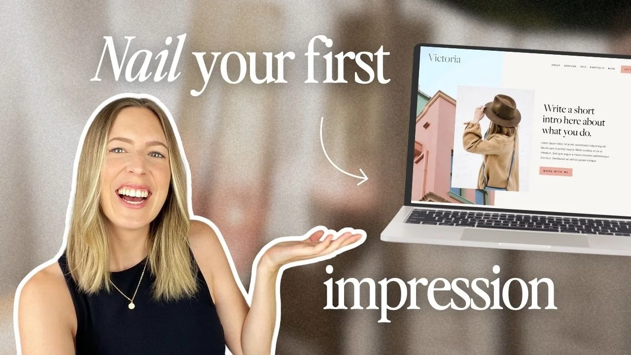
How to Design and Optimize Your Homepage for Better Results
Our brains start forming impressions in just a fraction of a second, so when someone lands on your website, they’re instantly getting a feel for what you’re all about. That first glance sets the tone, and it plays a really big role in whether visitors stay to explore or click away without a second thought.
Ruthless? Definitely. But with so much competition out there, you do really want to make sure your website is up to scratch, both in terms of looks and strategy.
Most of the time, that first impression happens on your homepage (aka the digital front door to your business), where it has only a few crucial seconds to answer two big questions:
What do you offer?
Why does it matter?
If something feels confusing, cluttered, or unclear, people will click away, often before they even scroll!
To keep visitors browsing longer on your site, we created this guide to help you spot the most common homepage mistakes, fix them with a bit of strategy, and create a homepage that feels clear, confident, and inviting from the very first scroll.
Let’s dive in!
What to Include on Your Homepage
A strong homepage doesn’t try to say everything. It focuses on saying the right things, in the right order. Your goal isn’t to overwhelm visitors, but to guide them smoothly through who you are, what you do, and what they should do next.
Here are the key sections every effective homepage should include to get your message across as clearly as possible:
Hero Section
This is your first impression moment. The very first thing visitors see when they land on your site. You want to intrigue them, spike their interest, and keep them wanting more all whilst clearly answering:
What you do
Who it's for
Why they should care
Design-wise, the possibilities are endless and it will really depend on your type of business. While a photographer might want to display a full-width image or slideshow of their very best work, a copywriter might want to dazzle with words.
Regardless, you'll usually want to include a strong headline, a short supporting sentence, and a clear call-to-action!

Homepage hero section in our Belladonna Squarespace template

Homepage hero section in our Ava Grand Squarespace template
About Section
You don’t need your full life story on your homepage (save that for your About page!). Instead, give visitors a quick sense of who you are, what you stand for, and why they should trust you. One paragraph is usually sufficient here, just enough to build connection and invite further exploration.

Homepage "About" section in our Sophie Squarespace template
Services or Offers Section
Your services section should quickly connect the dots for your site visitors by clearly explaining what you offer and how you can actually help them.
Think big-picture, super digestible, and ultra clear, then link each service to its own page for your site visitors to explore and get all the details.

Homepage "Services" section in our Verano Squarespace Template
Social Proof
Testimonials, client logos, case studies, and stats will help your visitors feel confident that they’re in good hands. Adding at least one form of social proof somewhere on your homepage is one of the quickest ways to build credibility and remove hesitation.
You can easily do this by adding a testimonial slider or an "as featured in" logo bar.

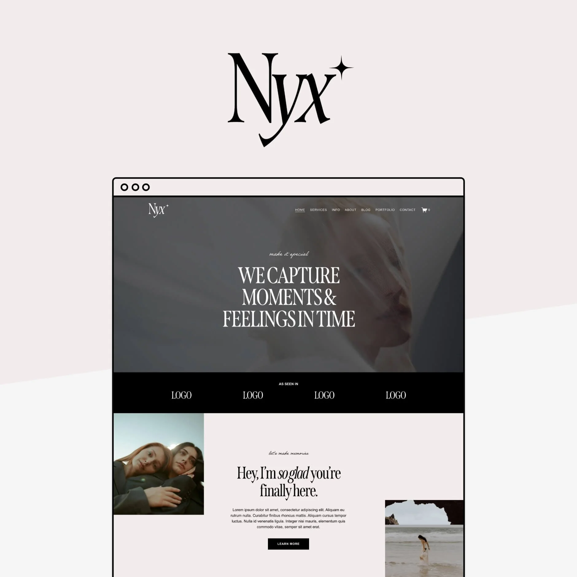
Example of a logo bar on the homepage of our Nyx Squarespace Template

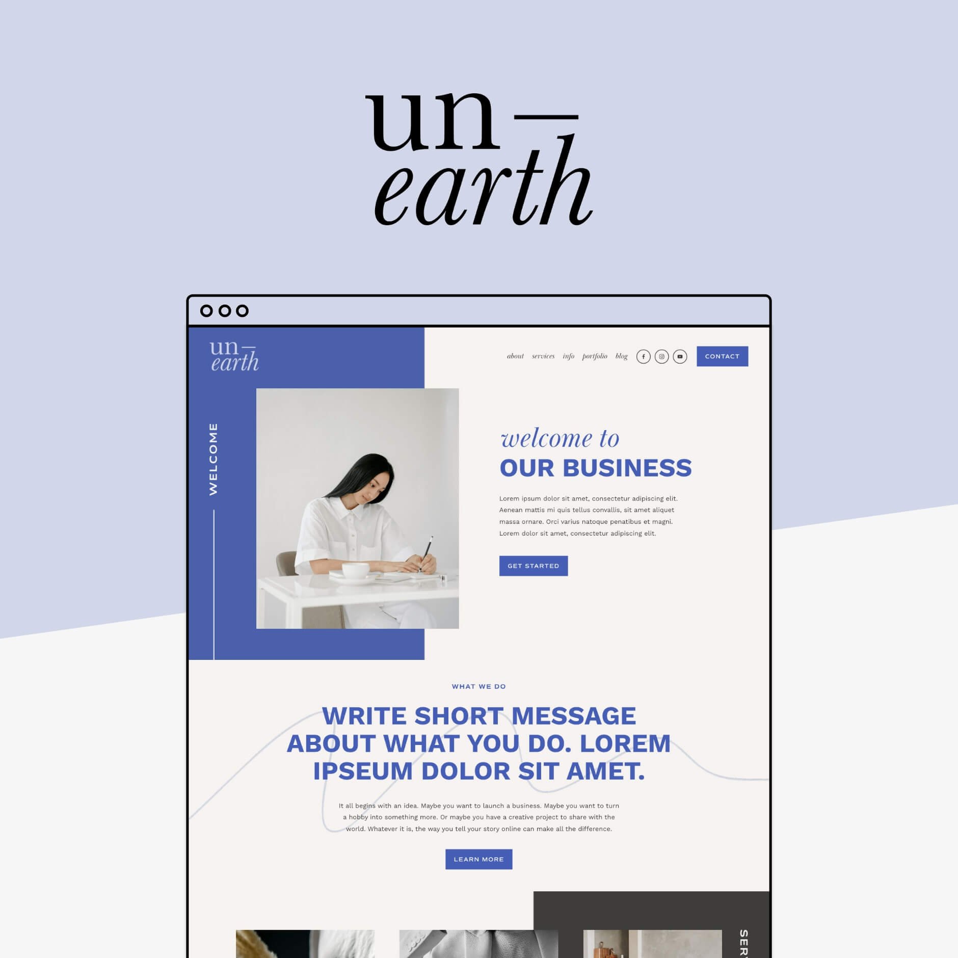
Example of a testimonial section on the homepage of our Unearth Squarespace Template
Links to Other Pages
Think of your homepage as a roadmap, each section pointing visitors towards the rest of your site.
To decide which other pages you might want to feature, think about which of ones help build trust, show your expertise, or move someone closer to working with you.
These might include:
Your portfolio, to showcase what you’re actually capable of
Your blog, to demonstrate your knowledge and expertise and keep visitors exploring longer
A freebie or newsletter signup, to build your email list and capture leads from people who aren’t quite ready to buy yet (but are definitely interested!)

Portfolio and Blog sections on the homepage of the Gigi Rose Squarespace Template

Freebie sign up section on the Nyx Squarespace Template homepage
Homepage Strategy Tips
Now that you know what to include on your homepage, let’s talk about how to make it work for you, strategically.
Get Crystal Clear on Your Message
If there’s one thing your homepage needs to do well, it’s clearly communicate what you do, who you do it for, and why it matters.This message should be front and centre, and easy for anyone to see (ideally in your hero section!).
When someone lands on your site, they shouldn’t have to hunt for context. Use clear, simple language, and make sure even someone with zero background knowledge could quickly understand what you offer.
And yes, absolutely put your own fun spin on it (just don’t let “clever” get in the way of clarity!). Too much branding fluff can quickly turn into confusion.
Make sure to include the three elements: 1. What you do. 2. Who you do it for, 3. Why you do it.
Example: We create Squarespace Templates for small business owners so they can DIY their dream websites easily and quickly.
If visitors can’t figure out what you do right away, they’ll leave. Keep it clear, specific, and upfront. This message should be the very first thing your website communicates!
Decide What You Want Visitors to Do (Then Design Around That)
Before you design anything, you need to know your end goal.
Do you want visitors to:
Book your services?
Buy a product?
Join your email list?
Read a specific piece of content?
Every business will answer this differently, and that’s okay! What really matters is being intentional.
Try working backwards, for example: if your end goal is that you want someone to book your services, they might need to contact you first. Before they contact you they will need to read a bit about what services you offer.
So, your homepage priority would be to direct visitors to your ‘services’ page where they can read more about the services you offer. And from the services page, you would have a very clear “contact” button or even a contact form on that page to book you!
If you goal is to get them onto your email list, then one of the first things you’re going to put on your homepage is a big and obvious opt-in!
The goal is to guide your visitor to do exactly what you want them to do! And it all starts on your homepage.
This section should sit nice and close to the top of your page, if not the very top, and somewhere next to your brand message. So your visitors can instantly know what you do, who you do it for, and why you do it. Then, the next thing they will see is an opportunity to learn more about it.
Cut Down on Homepage Copy Clutter
This one’s big.
Long paragraphs, too much text, and information overload will push people away fast. Remember: this is your homepage, not your blog or About page.
Your homepage should:
Highlight the most important information
Be easy to scan
Encourage visitors to click deeper into your site
You want to only give them the most important information in the shortest, easy to digest way possible.
If you have long blocks of text, move them to their own pages. Think of your homepage as a high-level overview. Once you’ve hooked someone in, that’s when they’ll be happy to read more.
Declutter your Main Navigation
Your header navigation plays a huge role in guiding visitors... and more links doesn’t necessarily equal better!
Keep your main navigation clear of any links that aren’t really important. Even if your site has 20+ pages, your main navigation should usually include only the most important ones (think 5–6 max). Ask yourself:
Does this page support my main goal?
Does it help visitors take the next step?
If not, it probably belongs in the footer.
For example: We have a “resources” page so we can show people all of the awesome tools that we use in our business. Yes, it’s a great page and it’s helpful for people, but is it helping us with our end-goal of selling products? Not at all. That one is definitely going in the footer! On the flip side, our “Shop” link definitely stays in the main navigation, because that’s what we really want people to do!
👉 How to Customize your Header Navigation in Squarespace
Use Social Links Strategically
Adding social media links to your site is a bit of a controversial topic. Some people argue against, saying you don’t really want people to navigate away from your website, others argue that they are a key builder of trust!
We believe that social media can be a great way for people to connect with your brand on a more personal level. If someone likes what they see but they aren't quite ready to book or buy, following you on social can be an easy, low-commitment next step that keeps you top of mind.
Just make sure that if you choose to link to your social media accounts, to only link to the ones where you are actually active and update regularly, and those where your audience actually hangs out! For us, Instagram is probably our biggest player, while it wouldn't make sense to link to our LinkedIn (where we never post).
👉 How to Integrate Social Media with your Squarespace Site
Just Good Design
Like it or not, design plays a massive role in how your business is perceived. A well-designed homepage builds trust instantly, while a messy or outdated one can make even the best business feel less legitimate.
Good design doesn’t mean:
Fancy animations
Over-the-top layouts
Spending thousands on a custom site
It does mean:
Thoughtful spacing
A site that works beautifully on all screen sizes
The fact is, good design sells because it builds trust, and that's what turns curious visitors into confident customers!
And no, you don’t need to blow your budget to get there. Great DIY options exist (we’re big fans obviously), and well-designed website templates are the perfect middle ground between starting from scratch and going fully custom.
If you want a little help making your site look polished without the designer price tag, our Squarespace templates are designed to do exactly that. Clear, strategically designed, and easy to use from day one.


So, that’s our top ways to nail your homepage, with strategy and good design. Now, go through your homepage and make sure that you have everything in this list!
Want more web design tips? Check out the blog posts below!
6 blog design tips for Squarespace
How to change the background color of a single page in Squarespace (Brine template)
5 simple ways to add a Portfolio to your Squarespace website
How to upload custom fonts to Squarespace
How to add a header video to your Squarespace 7.0 or 7.1 site
Pin this to Pinterest!
